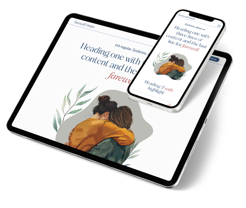
A startup digital service app dedicated to transforming the experience of end-of-life planning lacks a scaleable design system that enables rapid growth, brand building, and sustainable success.
My Role: As the sole UX/UI Designer, I collaborated with the Product Owner/developer to build a scaleable design system, develop user flows and create prototype frames for user testing.
OVERVIEW
For startups, UX/UI design is a vital component that enables rapid growth, brand building, and sustainable success. Rather than being just a cosmetic feature, good design is a strategic business tool that reduces development costs, enhances user retention, and attracts investors.
“UX designers act as a critical link between founders and developers, translating a big idea into a clear, user-focused roadmap. A solid design framework allows for faster iterations and makes it easier for the product to adapt as the company grows.”
PROBLEM
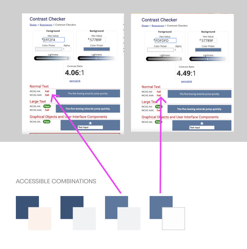
The project had a basic style guide but lacked usable components, a comprehensive type library, and had several WCAG accessibility issues. Resources were used inefficiently by not investing in UX design early on, which could lead to costly and time-consuming redesigns later.
Solution
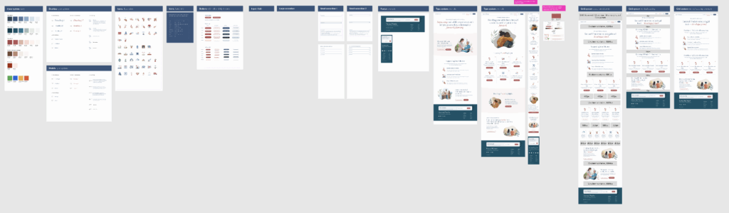
Along with constant user testing of current flows, build a scaleable design system based on atomic design principals that is anchored in Figma variables for the rapid changes needed in a startup
triage design mode
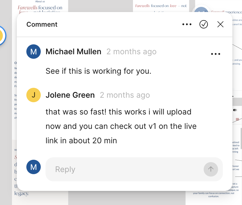
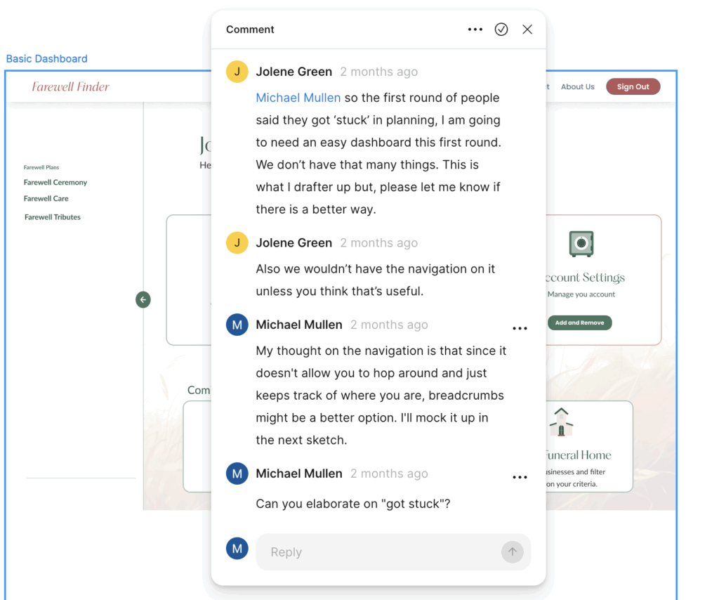
The goal of the company owner is to quickly build a viable app to get funding from investors. This fast pace meant that pages were built without a design system leading the way, which is fine for the immediate needs but is not sustainable. I was often in triage design mode, revising pages after they went live.
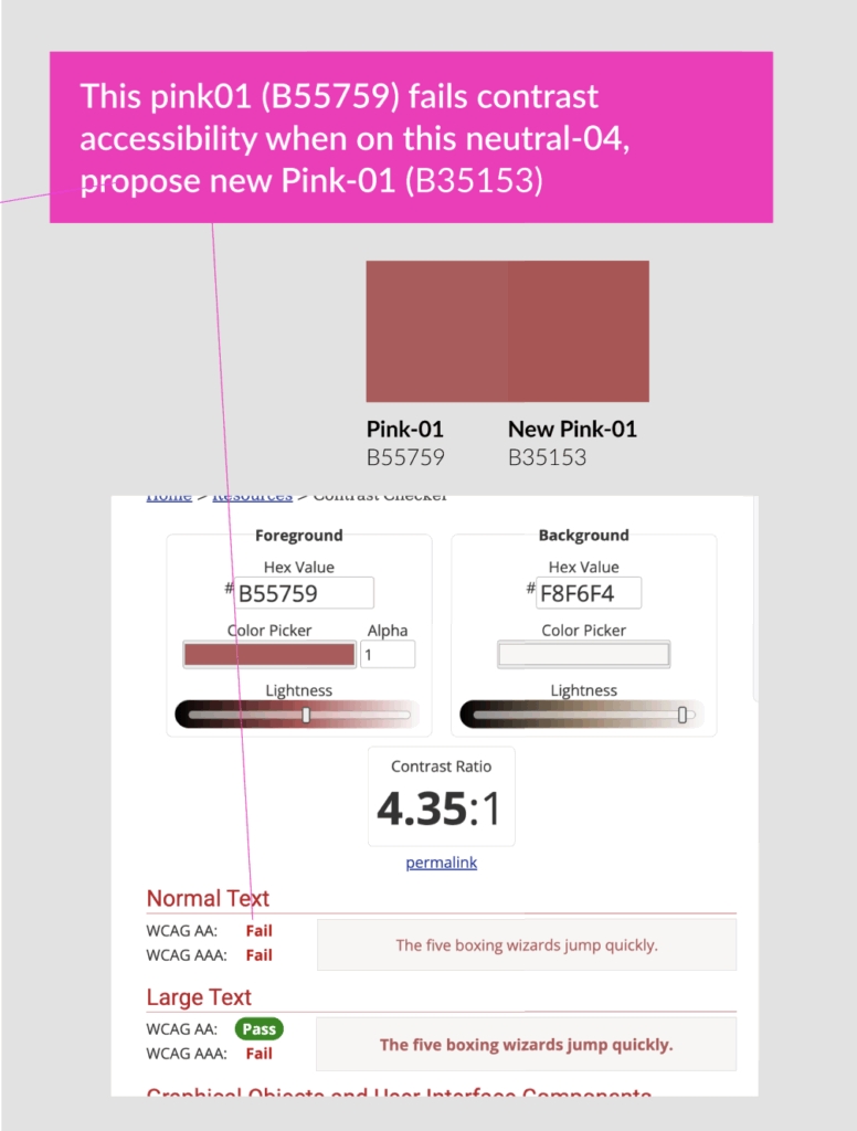
WCAG 2.1 accessibility issues
Even though the given style guide and documentation from an agency stated color combinations met accessibility standards it soon became clear they did not. I took the time to recheck color combinations and adjust colors using variables.
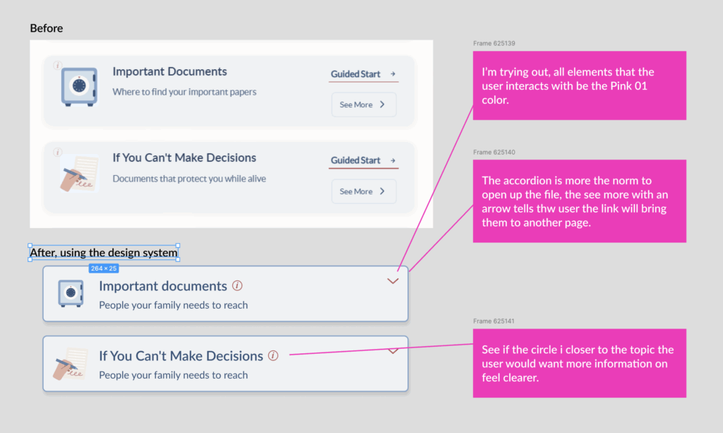
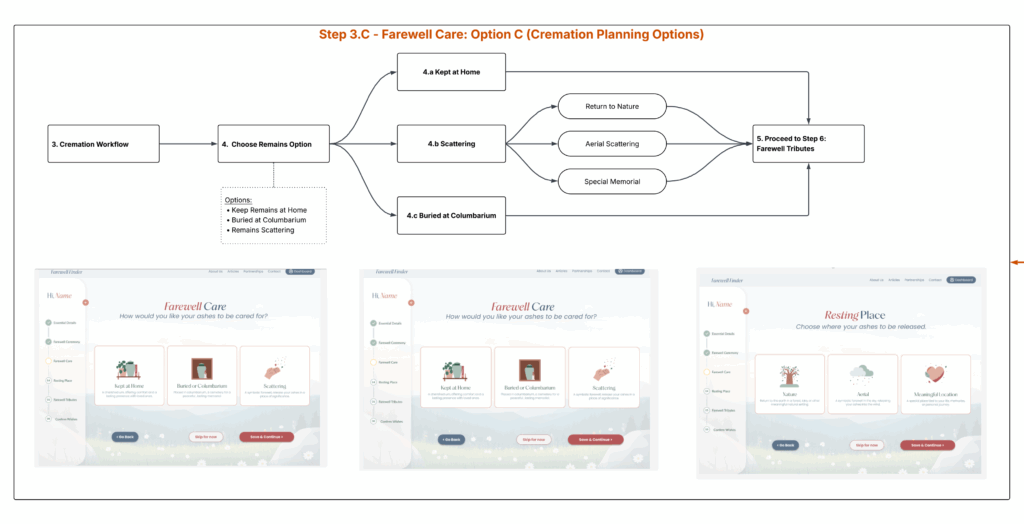
Eliminating THE TRACKER
I’m still trying to lead the owner away from the side navigation device and use a standard breadcrumb navigation. The side navigation adds nothing to the page, the user can’t use it to navigate, it’s not interactive, and it takes up expensive real estate on the page. We will explore other options and get feedback from users in the near future.
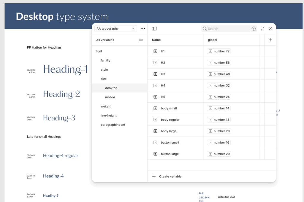
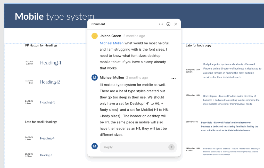
TYPE SYSTEM WITH VARIABLES
With a startup, font systems can change at any time in response to competition and market needs. I used variables for the typeface of title and body fonts as well as using them for sizes, weights, and leading for mobile and desktop. This gave me the flexibility I wanted for global font changes.
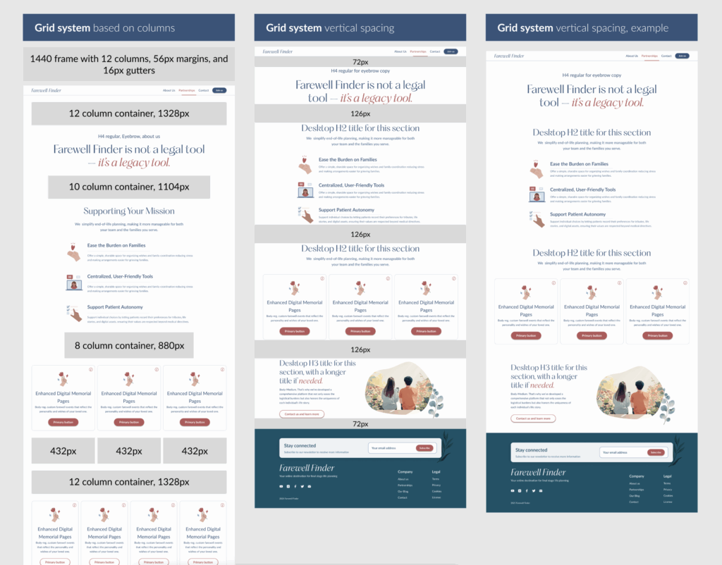
Rigid but flexible system
We needed standards for Desktop and Mobile grid systems, as well as best practices for vertical spacing. Giving the user lots of white space and a limited color pallet adds to the clean interface.
A work in progress
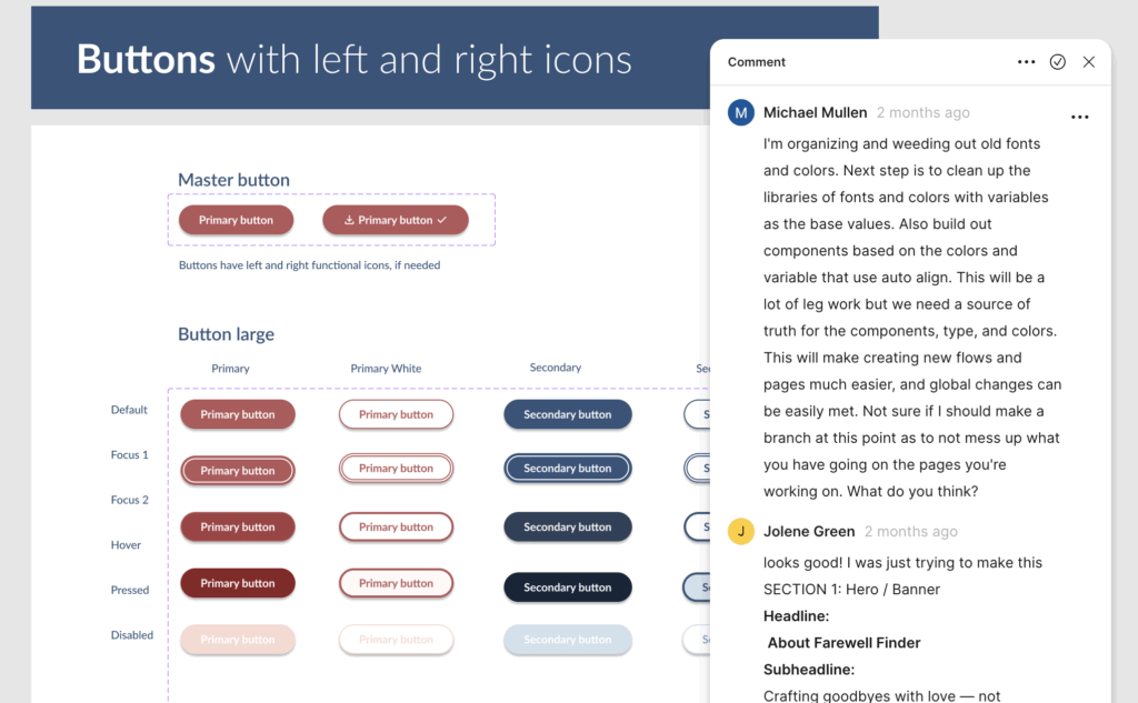
I recreated these buttons 4 times, until I arrived at the current solution that includes icons on either side of the button label. This is part of the future proof effort based on my experience with components that should’ve included future possibilities when first created.
"A solid design framework allows for faster iterations and makes it easier for the product to adapt as the company grows."
Design system, a work in progress
Next steps
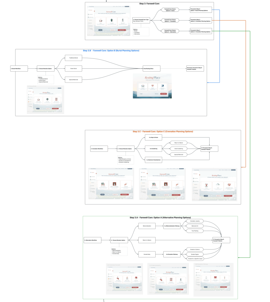
I want to circle back to review the entire flow of the app, especially the two different check lists the user is able to create. If I can get ahead of development I would create prototypes for key sections of the user journey, get user testing feedback and then present to the owner/developer.
On a side note, I’m currently taking an intense Front End Software Developerbootcamp with QuickStart. I hope to lend a hand in the development side of things as well.