REWORKING IA AND DESIGN SYSTEM TO CAPTURE MISSED OPPORTUNITIES WITH MANUFACTURES, ADVOCATES, YOUTH, AND MEDIA
My Role: Information architecture, User research, wireframing, low fidelity prototype, visual design system
Overview
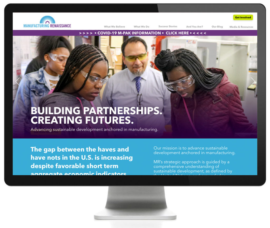
Manufacturing Renaissance is a Chicago-based nonprofit organization, founded in 1982 in effort to address the wide scale loss of jobs and its impact on communities. Today, their Mission is to advance sustainable development anchored in manufacturing.
The Task
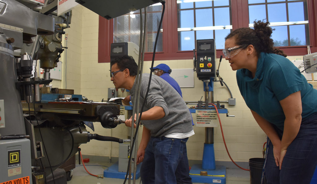
Help Manufacturing Renaissance make major updates to their website’s information architecture, layout, design, and navigation to showcase their programs and activities on a mobile-friendly and desktop platform.
My Role:
I was responsible for conducting user research while developing their information architecture and midlevel prototype as well as the visual design system.
• Duration: Over two months, part time
• Tools: Miro, Zoom, Adobe XD, Photoshop, Illustrator
Problem
Users expressed a disconnect with the organization’s goals and website. Existing web site has inconsistent information architecture and visual navigation clues, causing friction and leaving users frustrated. Although the services and topics covered are helping people and communities, there is little visual support conveying these concepts.
Solution
Build clear information architecture based on UX/UI best practices and user feedback from both staff and users outside the organization. Develop a consistent design system that leverages emotional full width imagery with bold typography. Make CTA clear with a consistent controlled color pallet.
A Little Affinity Here
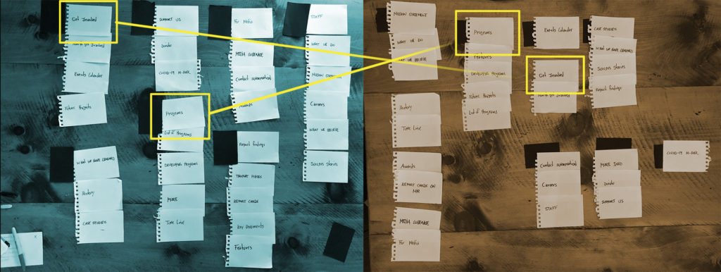
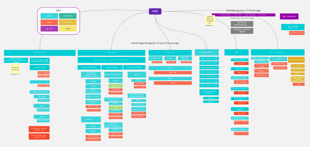
I asked several users to place main topics covered by Manufacturing Renaissance into groups, then asked them to name groupings. I was disappointed that this research resulted in only a few common themes and naming conventions. That research merged with my own interpretations became the starting point for the Information Architecture.
Loving Miro
I led several Zoom sessions with up to six participants while working with Miro to develop the information architecture. These sessions became extremely beneficial in moving the IA forward. The sessions became a platform where all parties contributed, as mountains of content were moved and edited in a fluid “live” group effort.

Who Are You?
There are three personas that the site wants to reach.
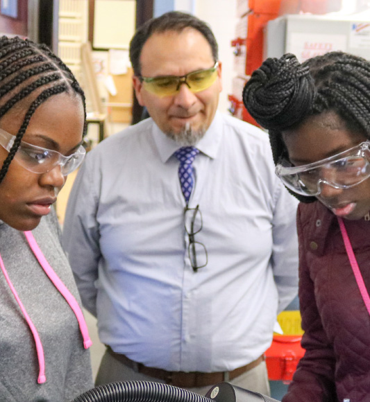
Manufacturer
Small manufacturing company at risk of closing because there is no apparent successor to take over the business.
Goals: Find trained employees that can join the team
Frustrations: Lack of motivated workers.
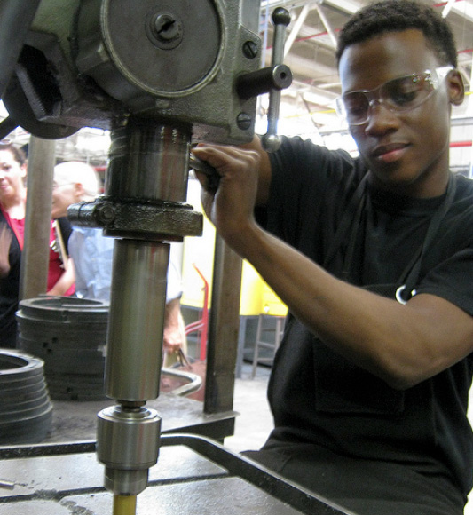
Teen/Young Adult
Young adults ages 18 to 29 who are working in manufacturing or aspire to work in manufacturing.
Goals: Recieve job training and critical support overcomeing a variety of social barriers.
Frustrations: No clear path to a fulfilling career.
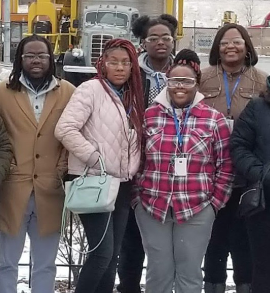
Community Advocate
Advocates for policies and programs related to expanding manufacturing in our region.
Goals: Community development, not private accumulation of wealth for a few individuals. Community will have an appropriately significant number of jobs and apprenticeships.
Frustrations: Productive sites for area residents turning into parking lots for containers.
Wireframing
Working with the new IA to develop the wireframe prototype became a process of give and take, with organization stakeholders still weighing in on content. Zoom and Adobe XD sessions were conducted with five users, testing for friction areas of the architecture and design system.
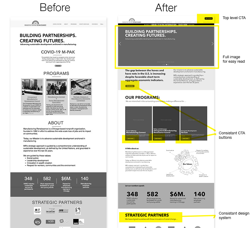
- Typography with more depth
- Use of design grid
- Designated CTA color
- Consistency in elements/functions
- More photos for emotional appeal
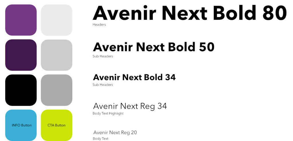
Visual Design System
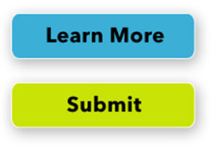
Colors lifted from the logo are offset with a lime green for CTA buttons. The “more info” and contact buttons use the blue from the logo. Users liked this offset color as the attention getting CTA button color.
Clickable Prototype
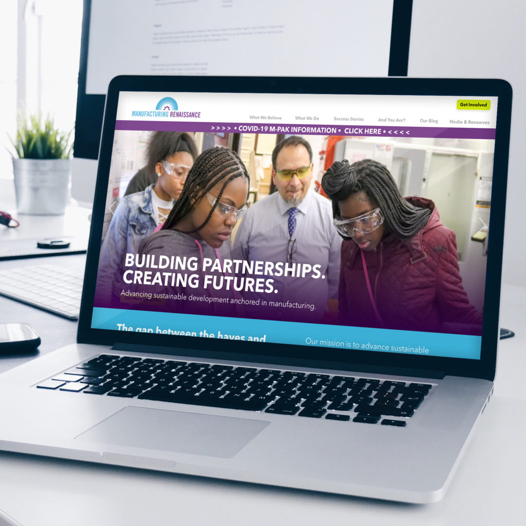
Further iterations of mid-fidelity prototypes were developed based on user feedback from five tasks performed by six users, most unfamiliar with organization. Implementation of design system was used for full color pages used as design.
Tasks:
- You are a young adult, learn more about how to get a job or training in manufacturing.
- You are a manufacture, get involved with this organization and find out more.
- You are a Television, get information on a story “Ways To Boost Manufacturing In The Chicago Region”.
- What is their response to COVID.
- How can you help?
Next Steps:
- Continue to build website using WordPress and Elementor
- Continue user testing on site for friction points
- Revise key pages and art direct hand off to internal designers
- Link to work in progress site: http://mrtemp.org/
- Disclaimer: This site is now in the hands of M.R. I’m no longer responsible for it’s content or design.
Lessons Learned
- Stakeholders have goal setting views of a site’s structure that may not be what works for the general users.
- Prepare for Zoom, Miro Information Architecture sessions by prepping the team with goals and possible homework.
- A website is a living visual space that will continue to evolve.
