Elevance Health
Foolproof vs Flexibility
Omnichannel Marketing lacks a user-friendly, self-service solution for creating and maintaining brand-adaptable landing pages or microsites.
My Role: As a senior UX Designer, I collaborated with Product Owners, Developers, and AEM Authors to support evidence-based design and prototyping for the Omnichannel Marketing Campaign design system.
Overview
Empower non-technical business users with the ability to manage content at scale.
.
“Responsive design is the responsibility of the developers. A content author (marketer) does not need to worry about responsive editing or the layout. We are given a template to use and then we fill in the content.”
Unknown AEM author
Problem
Omnichannel Marketing doesn’t have an author friendly, self-service solution for creating and maintaining brand adaptable landing pages or microsites in Adobe Experience Manager (AEM) .
Solution
Develop a standalone AEM component library and design system, accompanied by a best practices guide for marketers to simplify the authoring experience.
Marketers are not designers?
When non-designers design web pages, they often struggle with creating visually appealing layouts, choosing appropriate color schemes, maintaining consistency in typography, and understanding the importance of white space, potentially resulting in cluttered, confusing, or unprofessional looking websites, even if the content is good.
Consensus
The first step is to reach consensus on the key components based on user patterns. This data was gathered through “Component Counts,” analyzing actual user movements on existing sites.
The goal is to develop these components to closely resemble the existing enterprise component library while ensuring they can evolve alongside the Anthem, Carelon, and Wellpoint brands. The components should also be scalable across all brands.
Greater flexibility
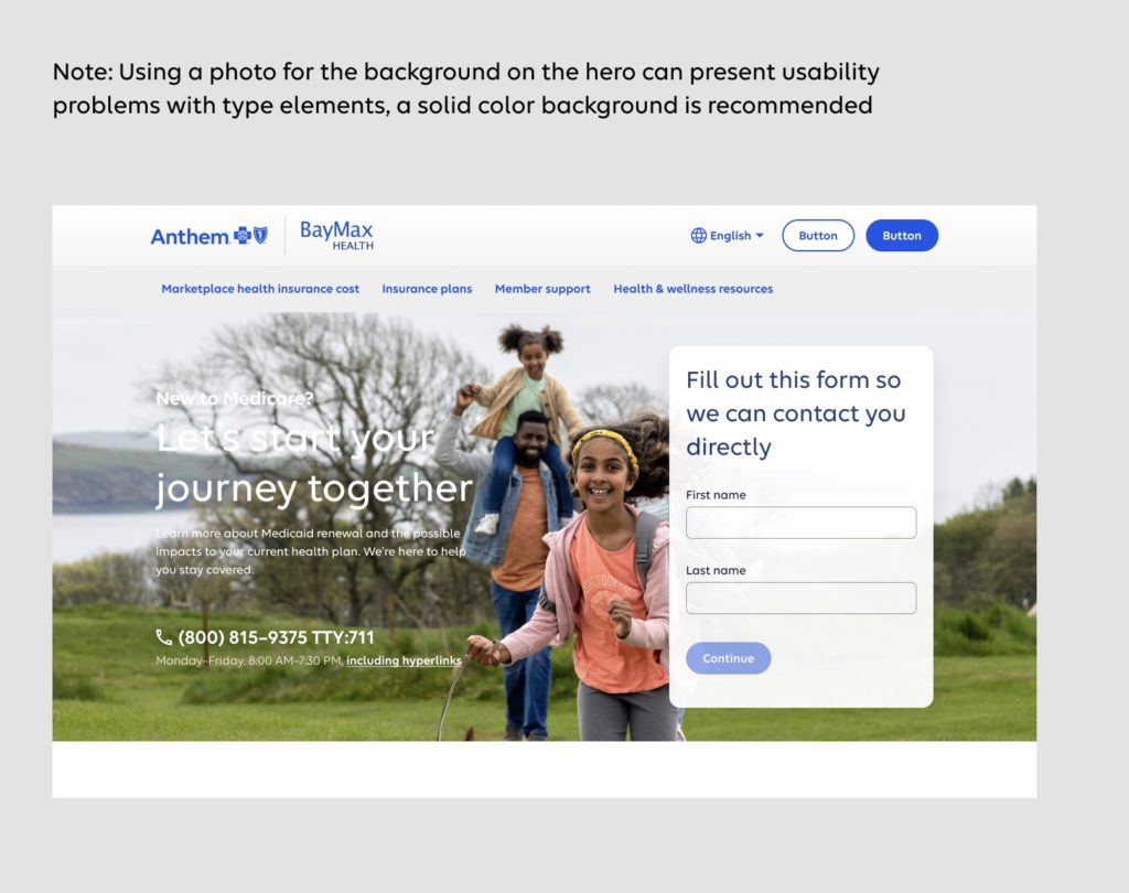
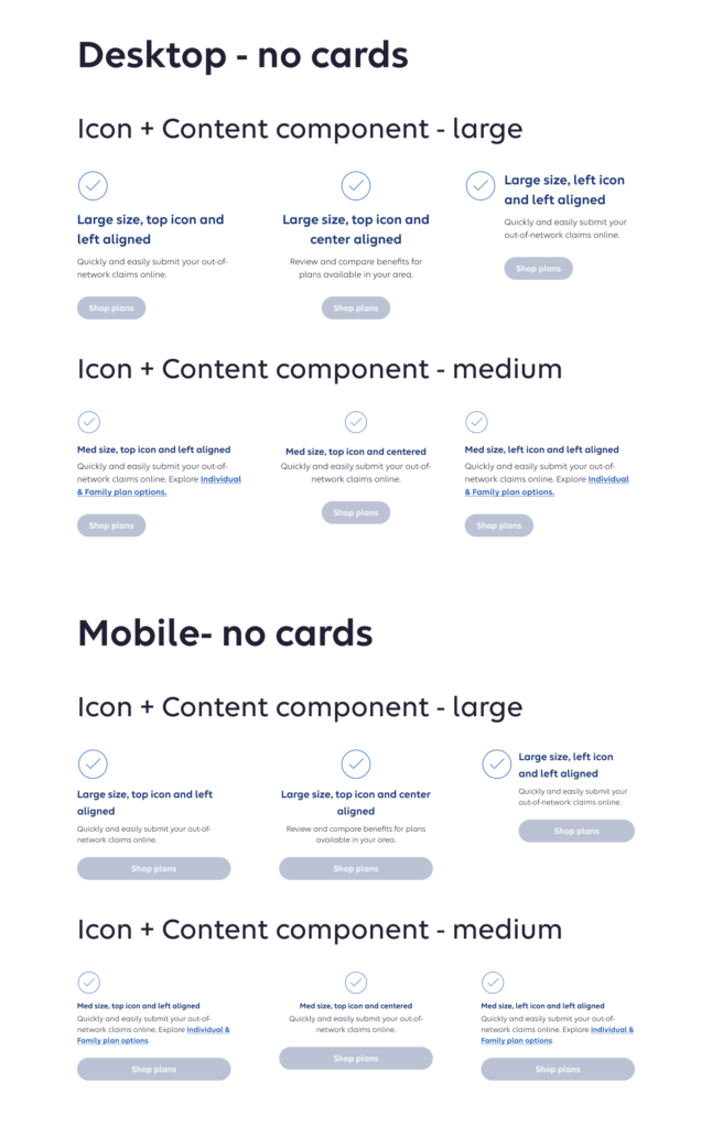
We proposed a series of templates to maintain high UX design standards and ensure consistency between pages. However, marketers desired greater flexibility than templates could offer, so we reached a compromise by adopting an atomic design system that emphasizes the top tier of organisms.
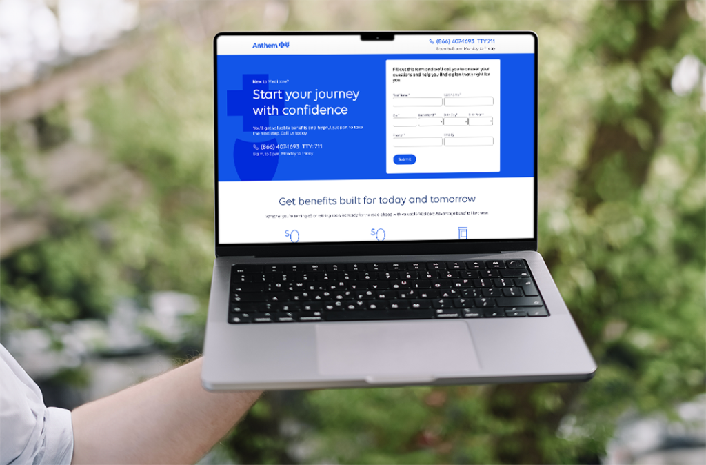
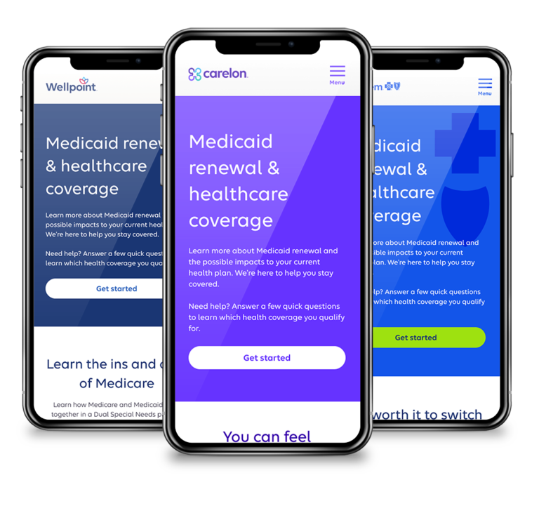
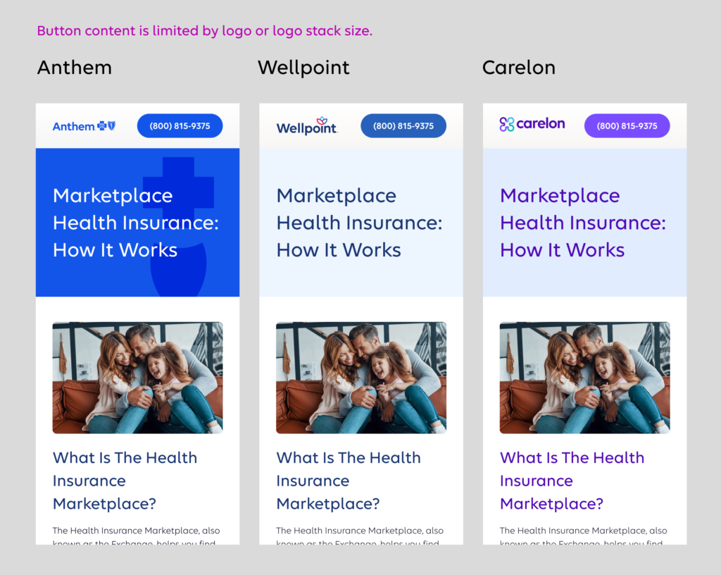
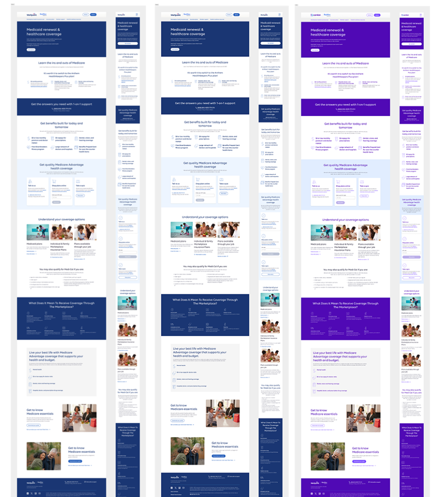
We developed new AEM components that closely resemble the existing enterprise component library while ensuring they can evolve alongside the Anthem, Wellpoint, and Carelon brands. These components are designed to be scalable across all brands.
Icon + Content component in action
Gathering input
Input was received from various teams, including Engineering, Product Owners, AEM Authors, and Marketers. We relied on the marketers experience with their targeted users to help fill in for user testing at this stage.
Build it first
We designed components that were interchangeable across products by utilizing Figma variables to ensure brand consistency and flexibility.
Although the initial setup appeared tedious, we appreciated the power and flexibility that the Figma variables offered.
total loss of control
We conducted research, compiled information, built and vetted our design system, and created best practices pages to guide our Marketers. However, our control ends there.
This is an uncomfortable situation for a designer, as we typically validate the pages we’ve designed after they are built by engineers, but before the site goes live. Often, we undergo multiple rounds of revisions to ensure the design is UX-ready, meets accessibility guidelines, aligns with our brand, and serves as an effective communication tool for the company.
Example of what not to do with the landing page type
How do we judge success?
Overall I’m pleased with the pages created by our marketers. While there are aspects I would change, they represent a significant improvement for the brand and accessibility.
It’s too soon to get enough data for an evaluation of success. Here are the key points to measure that success.
- Authoring is more efficient.
- Less time to create a single component
- The requirement for HTML and CSS knowledge has been minimized.
- Templates and components are more scalable and across brands.
- Design teams will have access to Figma files that represent the component library used in AEM.
- There will be documentation for design tokens with examples.
