A CULTURAL EXPANSION APP THAT BECOMES YOUR GUIDE TO THE UNEXPECTED.
My Role: User research, sketching, paper prototyping, wireframing, logo development, visual design system
“They’re going to look at this level, which I have no interest.”
Overview
ATTENDANCE IN MANY MUSEUMS ACROSS THE COUNTRY IS SLOWLY FALLING. PEOPLE ARE BECOMING LESS INCLINED TO VISIT MUSEUMS AND GALLERIES,
The future of museums depends on securing current, but, more importantly, future visitors. The only way to do this is by understanding the audiences they attract as well as the ones they do not. They need to attract visitors across all demographics to remain relevant.
The Task
My goal is to position these institutions of culture and learning toward our culture of connection and accessibility by letting the user follow their interest with ease and share their experience with others. I will need to accomplish the following:
Create an app that captures the surprise and wonder that Museums offer
Give the user easily read information about their destination
Ease user wayfinding pain points inside museums
Create a social network of museum explorers
My Role:
I was responsible for Research, Ideation, Sketching, Navigation, Digital Wireframing, Digital Prototype on this project. Others were consulted for feedback as user testing was a continuous part of the process.
Duration: 3 Weeks
Platform: Native
Tools: Pen and Paper
Other Tools: Google Forms, Google Sheets, Adobe XD
Problem
Museums are at the center of communities and the heart of preserving history, but to achieve these goals, they need to attract visitors across all demographics to remain relevant.
Solution
Create an experience of surprise and wonder for the user with randomized exhibit options based on the users interests. Instill a culture of exploration and sharing of experiences with others on the app. Address usability issues for seniors.
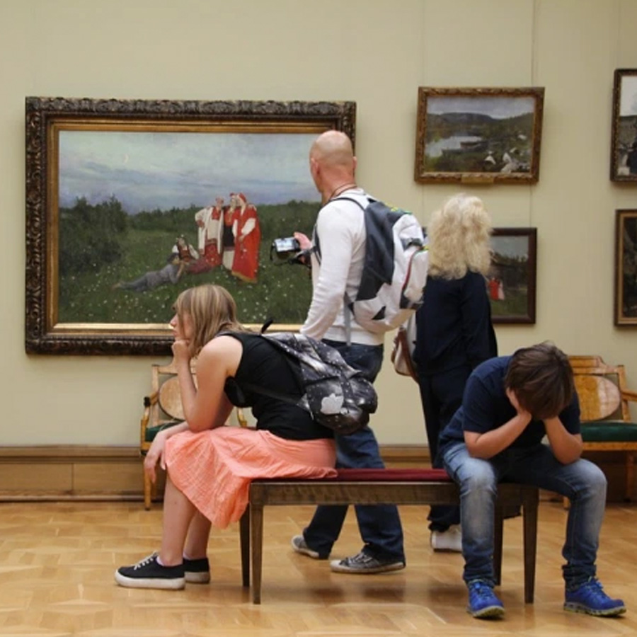
“I learned early on that the trip wasn’t for me.”
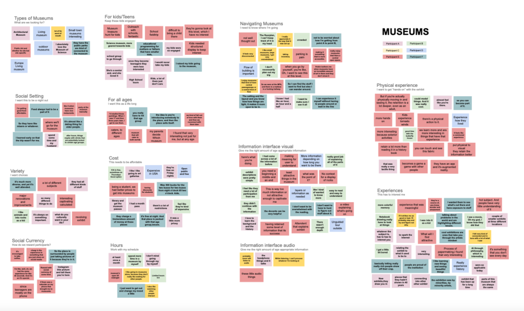
Empathy Map
I interviewed six users to discover their delight and pain points around the subject of museums. Each museum is different, they each have their own site-specific strengths and weaknesses. Many of my user frustrations with museums and attractions were beyond the scope of this app and were the responsibility of the museum’s physical structure and it’s exhibits. Given that some of these pain points were strong I wanted to address them in any way I could.
Museum Frustrations
Confusing Floor Plan – “the floor plan, I can’t keep track of it in my head”
Visual Information, too little, too much – “layers or information as needed”
Admission Price – “they charge a tremendous amount of money at these places.”
Accessibility – museums, especially older museums and historic sites, were often not designed with accessibility in mind.
Amenities – “food always had to be a part of it.”
Exhibits – “basically letting really really rich people show off their crap.”
Museum’s Responsibility
I realized there are many frustrations myusers experienced that are beyond the reach of the intended app and are the museum’s responsibility, they include: floor plan, wayfinding system, visual exhibit information, accessibility, quality of exhibits, amenities, and admission price.
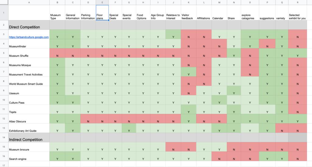
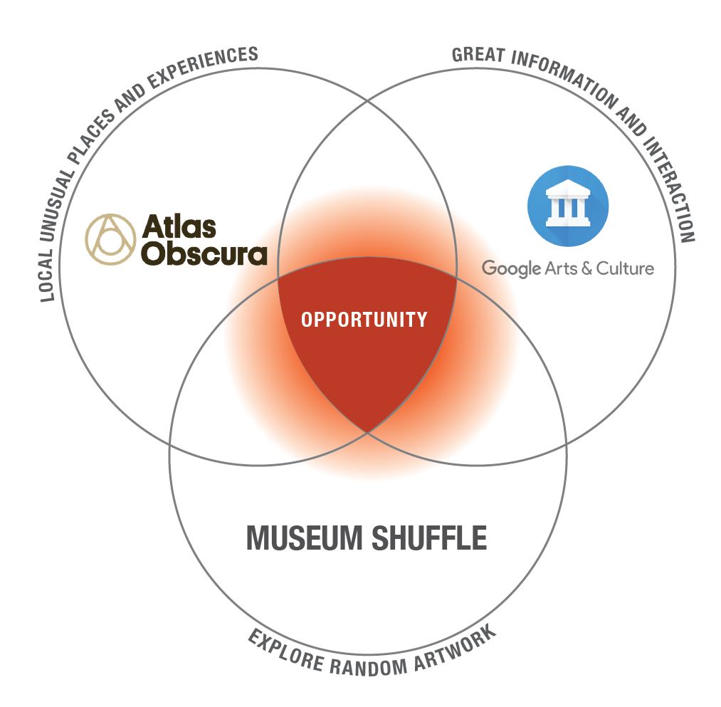
Competitive Research, Great Data, No Surprise
Google’s Arts and Culture and Atlas Obscura stood out as great databases for finding nearby museums but neither of these had the element of surprise I found in the Museum Shuffle app.This app let the user explore random artwork from the Rijksmuseum in Amsterdam with the “Shuffle” button.This was more of what I was looking for in my app.
On a side note, instagram-able pop-ups, like the Museum of Ice Cream, The Color Factory, and Candytopia offer interactive and photogenic environments that often cost more than the price of admission at a museum.With this backdrop, there is a need for all types of museums to grow their reach and cater to their existing visitors.
Opportunity For The Unexpected
Each of these apps did something very well, Google Arts & Culture had an incredible data base, Atlas Obscura highlighted local areas of interest, and Museum Shuffle had the element of surprise, butnone of them allowed the user to choose areas of interest and reward them with unexpected options as a result.
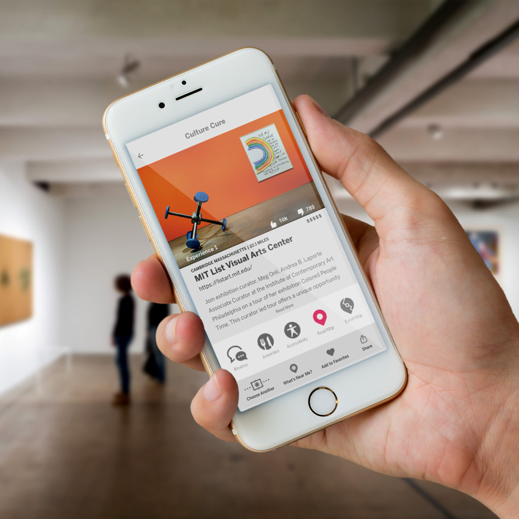
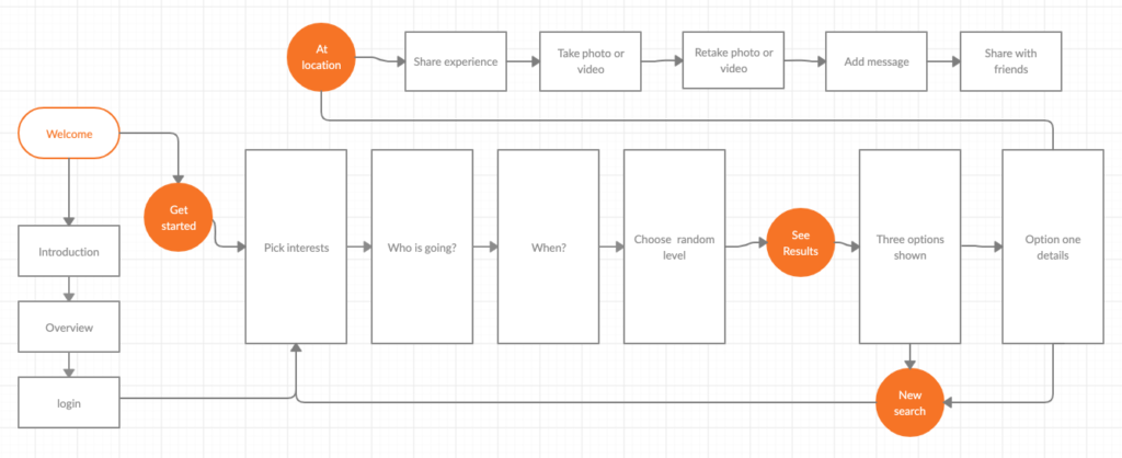
The Culture Cure app asks the user to choose from 16 diverse interests then surprises the user with results of four exhibits/locations that the user wouldn’t normally find on their own. These results are age relevant, have information on price, amenities, accessibility, location, and distance from user.
Future Features
Wayfinding map to their exhibit
Share selfies with the Culture Cure community
IA Navigation
Navigation should be direct, leading the user directly to their interest driven options. Considerations of age, accessibility, and distance are taken into account with the results.
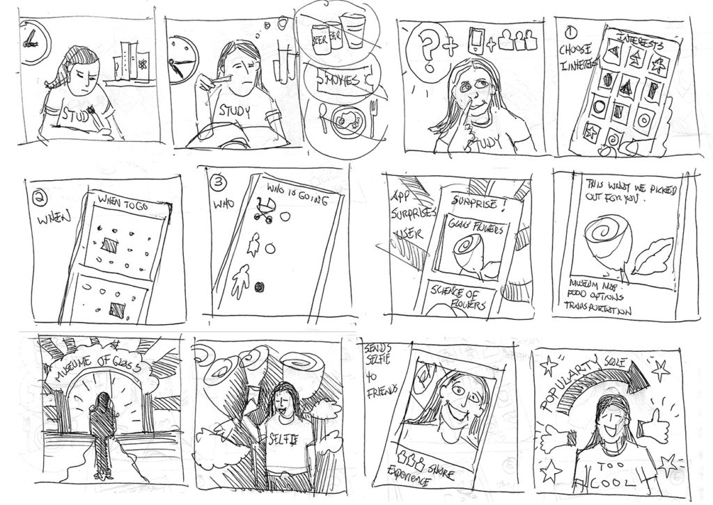
Sketching & Paper Prototyping
After some initial research with Marvel paper prototypes, the screen for “Level of mashing” was omitted. Interviewedusers asked to decide for themselves which results they preferred.
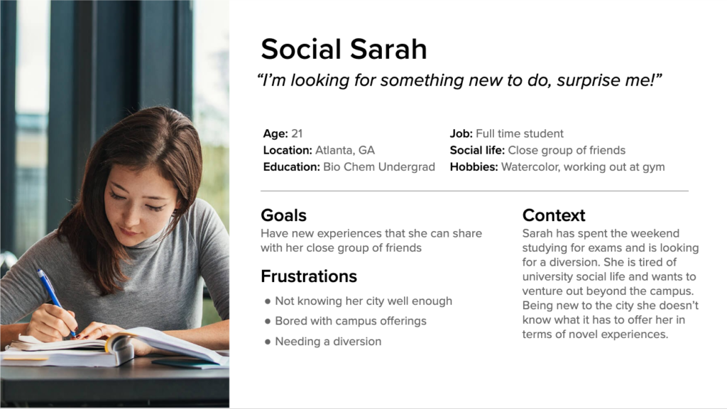
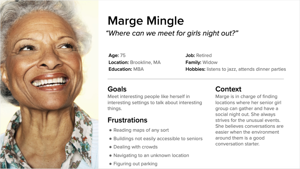
Who’s Going?
I developed three personas based on the wide age range museum and exhibit goers.
Wireframing
Important information needed to be easily accessible. I decided on using a system of icons for reviews, amenities, accessibility, road map, and newly created event map.
At this point I’m wrestling with having too many icons, too much information and too much visual noise. Two articles I read advised on scale, distance and contrast of my information. I had to sacrifice the number of icons used but too many icons became a lot of visual noise for the user.
A few more rounds of user testing followed by smaller revisions brought the wireframe closer to a useful clickable prototype. I used Adobe XD for wireframing and Adobe Illustrator to finesse found icons and create some that didn’t exist, Event Map and OC icons.
Next Steps:
Further research on accessibility issues for digital devices.
Develop wayfinding feature based on current and future technologies
Build a high fidelity prototype, continue user testing
Explore idea of connecting the app to “Merch” for attracting younger generations.
The Learning Curve
Pay more attention to accessibility / readability issues.
Don’t take on every pain point the user has, chart a course and do that one thing really well.
Resist getting bogged down in the visual design system until it is time to do so.