
Forward Hope: Website and Branding
WEBSITE DESIGN FOR MENTAL HEALTH PROFESSIONAL SPECIALIZING IN RELATIONAL, COGNITIVE BEHAVIORAL, AND MINDFULNESS PRACTICES.
Overview
APPROXIMATELY 1 IN 5 ADULTS IN THE U.S.EXPERIENCES MENTAL ILLNESS IN A GIVEN YEAR, AND YET NEARLY 40% OF THEM DON’T SEEK TREATMENT OR HELP FROM OTHERS.
The Task:
Develop the visual brand for a Licensed Mental Health Counselor business starting up in the North East.
- Develop a flexible visual brand system and logo
- Create a website based on best practice of UX/UI
- Create supportive materials for the business.
My Role:
I was responsible for the Research, Sketching, Navigation, Digital Wireframing, Design System, Logo development and Digital Prototype for this project though I did collaborate with others for feedback and user testing throughout the process. Note, this user testing was limited base on the number of users I could interview during the COVID-19 restrictions.
- Duration: 2 Weeks
- Platform: Responsive
- Best Tools Used: Pen and Paper
- Other Tools Used: Adobe Illustrator, Adobe XD
Problem:
Develop a touchpoint for users needing the services of a mental health business. Create the visual design system for this company that reflects the owner’s approach to counseling.
Solution:
A visual design system and website built with mental health seekers in mind.
Competitive Research
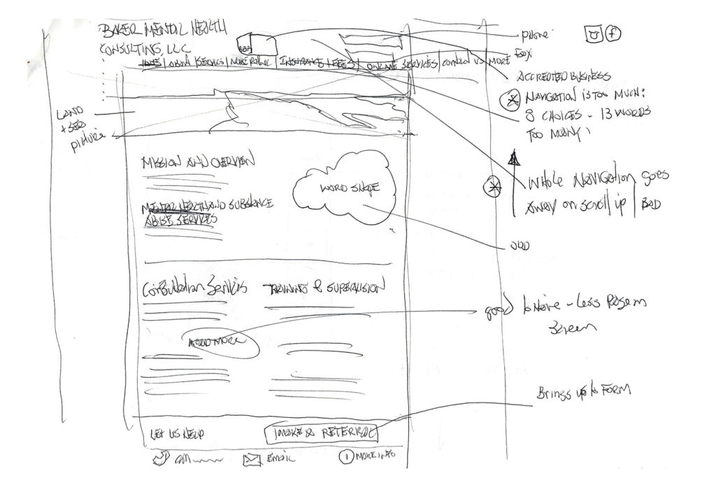
Competitive research revealed many sites with user ability problems. I made notes about what worked and what didn’t based on best practices of navigation and visual design elements.
Based on this research it’s important to have:
- Top navigation available at all times with contact button
- Open clean inviting presence with affirmations
- Straight forward navigation
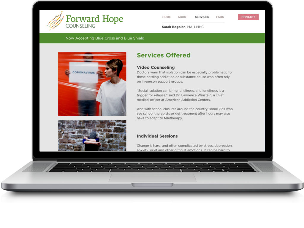
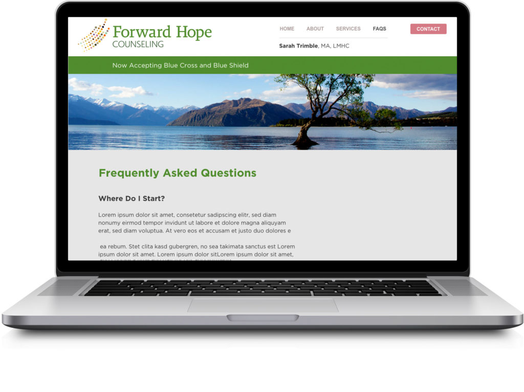
Visual Design System
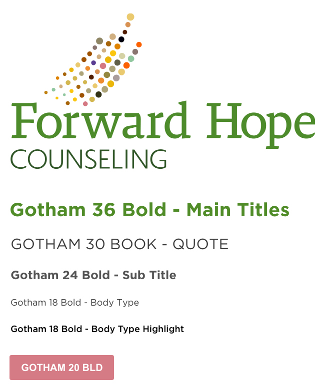
During my research I came across this article, Designing Experiences To Improve Mental Health. Based on this reading I redirected my visual design system to include a logo with a positive emotional appeal that hints to community. This suggestion to “Encourage connection to external supports” along with six other guidelines helped me create a more approachable website for the user.
The color system is progressive and personal, staying away from harsh corporate colors. The use of Gotham book and Gotham bold provided the open airy feel I was looking for in a font.
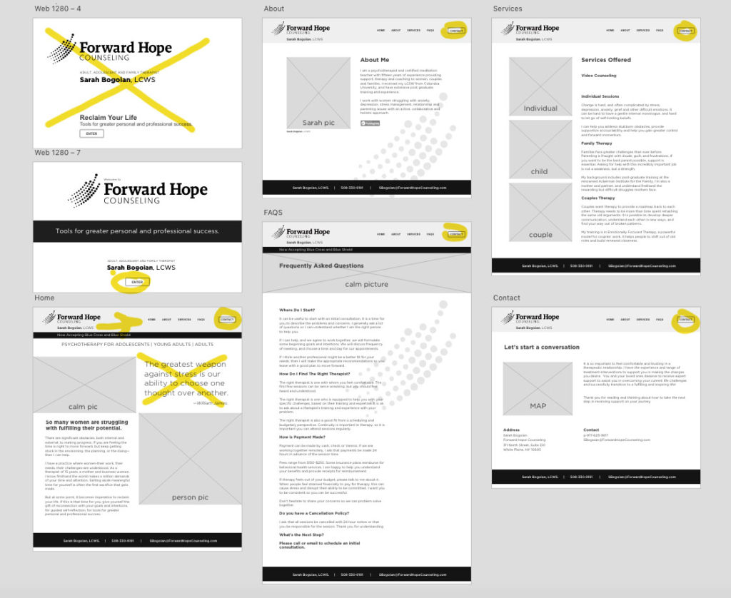
Usability Testing
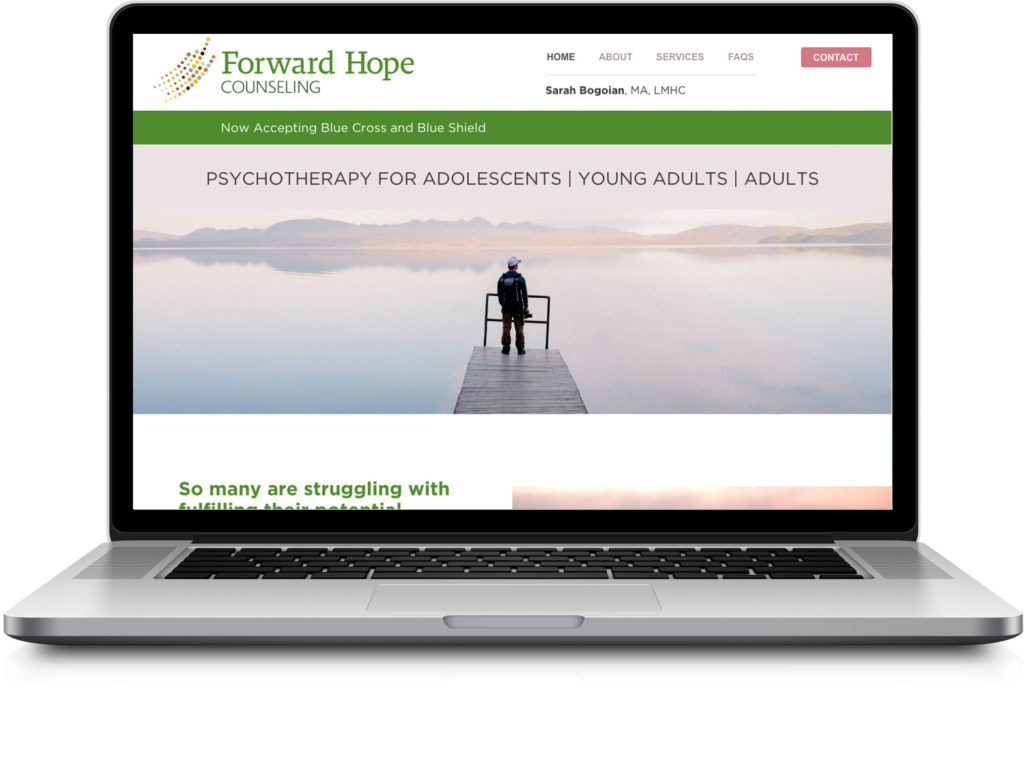
Based on usability testing with three users I made adjustments to the header, cutting down on some visual noise by moving the name and title to the left and giving the contact button more prominence. I cut some of the larger type elements that were just decorative and didn’t add useful information for the user.
Visual Design Prototype
I built out on-boarding screens and completed the digital wireframes combining them into a clickable high-fidelity prototype. The prototype presented here is kept to a slide show for review functionality.
Need to:
- Adjust website based on actual copy provided by copy writer.
- Create print branding elements, 8’x1’outdoor road sign,
- Create letterhead, business cards, way-finding for inside building, trifold brochure.
Lessons learned:
- More appreciation designing experiences concerning mental health issues
- Using pen and paper to draw problem areas of competitor sites forced me to have a deeper understanding of what isn’t working with their navigation and visual system.