Treasury management onboarding process for internal and external users
My Role: As a senior UX Designer, I partnered with Developers, User Research, and Product Owners, supporting evidence-focused design and prototyping for treasury management on-boarding process.
Overview
The Treasury Management Onboarding process is a complex, time consuming system requiring several approval layers, lots of documentation, and detailed onboarding procedures involving multiple stakeholders. The process can take months to complete by frustrated treasury managers, is riddled with errors, and costs the bank time and money.
“These are all the questions we go through on paper... having this pre-filled would save us a lot of time and we could touch on this info with the customer"
Problem
How can we take the Treasury Management Onboarding process that can take months to complete, to one that can be completed within a week, and with fewer errors?
Better yet, how can we then Fast Track this process to within 24 hours?
Solution
Combine separate external forms and applications of the onboarding process into one Treasury Management Onboarding experience, cutting down on time and costly errors. Build an onboarding platform with clear directions based on best UX/UI practices
Tempers high, Communication low
I entered the project at a low point.
No lead time for research and design
Disconnectbetween Developers and Designers
An uneasy client
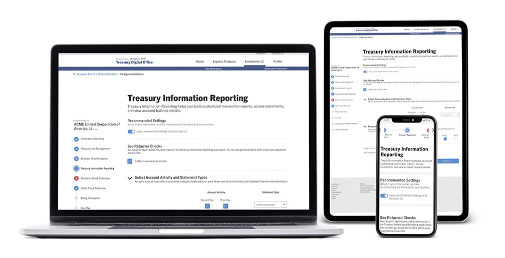
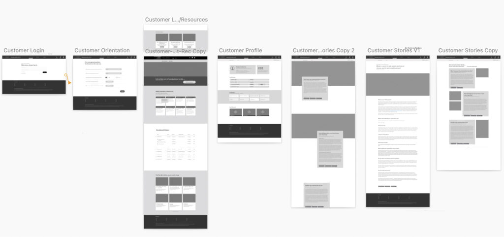
First goal was to ease some of clients client’s concerns by creating a future state user journey prototype from login to product exploration. This tangible exploration based on user feedback, eased tensions for both the product owners and leadership.
My second goal was to improve the working relationship between designers and developers, both going full speed ahead with little communication between them.
good Design is a team effort
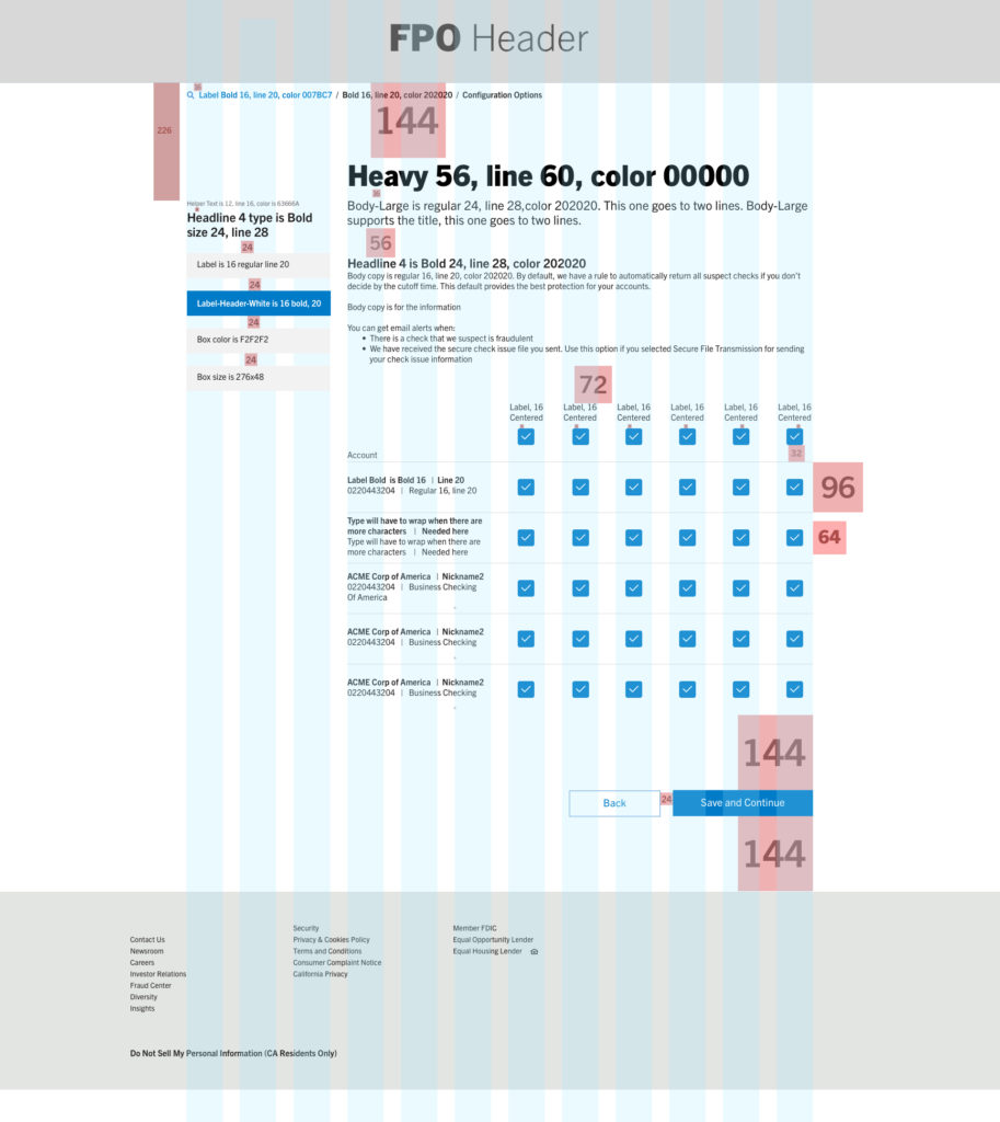
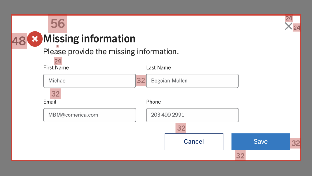
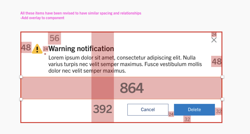
It became clear that our developers needed to receive pixel perfect visuals with clearly labeled dimensions and typography notes. Based on user concerns for clean forms that don’t overwhelm, I designed templated pages based on a 12 column grid with typography, spacing, and color, that aided in the developers’ and designers’ consistency and speed.
I became the point person for an audit on the developers side, working one on one to fine-tune their work to match the design system.
Before visual aids of the Design system
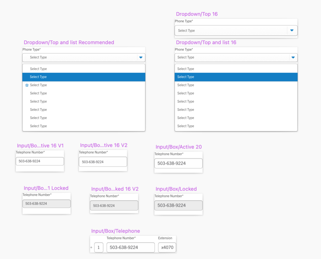
Design System
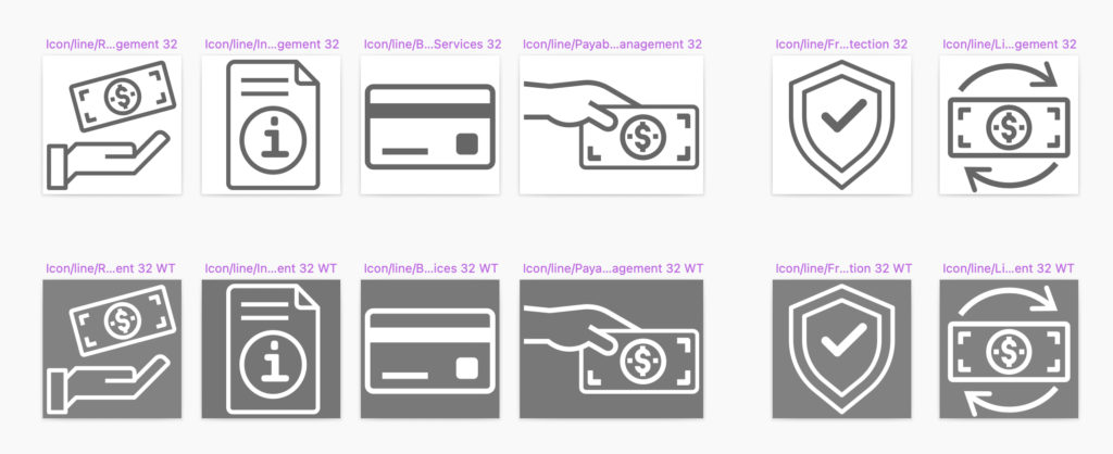
Following the principals of atomic design I developed design system components with states and micro-interactions. For this system I also built easily read icons conveying brand personality and banking product type. I had the team vote during our design meetings with colored stars, getting consensus before presenting too the PO. Continuing this practice strengthened communication within the team while moving the design process forward.
Accessibility is experience design
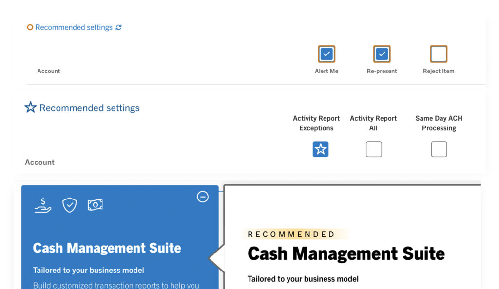
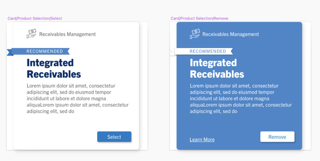
The product owners concept of “Recommended” needed to evolve from a box outline, to star icon, to badge with” Recommended” spelled out for better UX accessibility on screen readers.
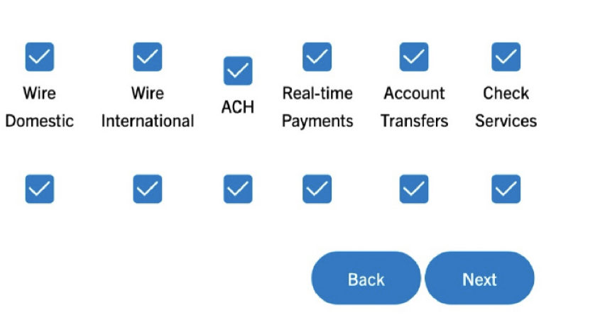
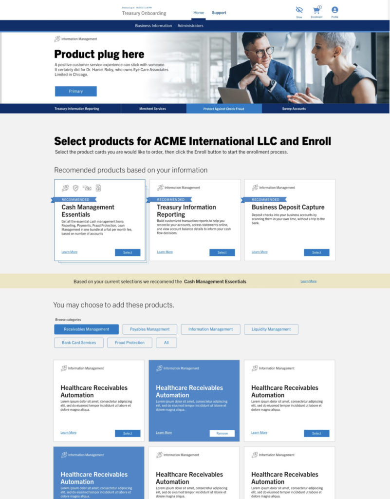
I developed a system of components for clear labeling of product cards using icons for product families and “Recommended” badges for clear user choices based on their business type.
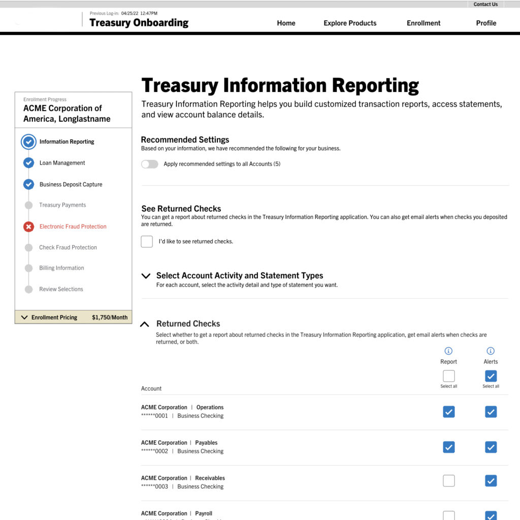
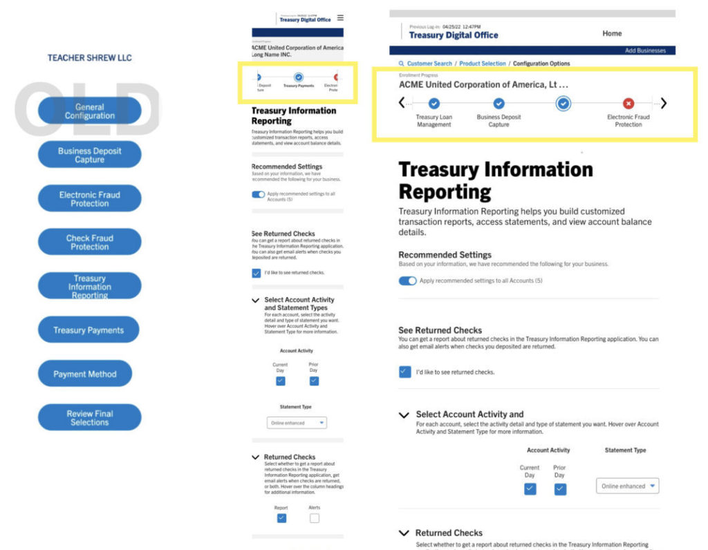
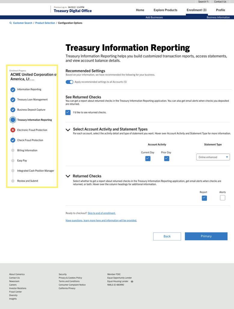
Evolving the tracker
Based on user testing the tracker for the onboarding process needed give the user more information about their enrollment progress. This redesign of the tracker provides a more user friendly enrollment navigation system with states for errors, focus, and level of completion. This system is designed to be responsive and works well for future state tablet and mobile.
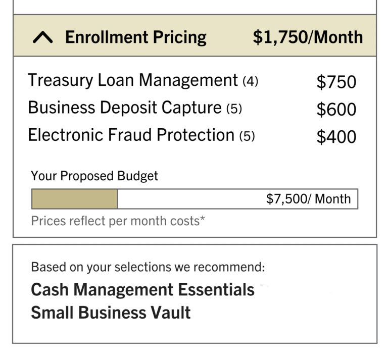
Pricing feature
The complex issue of pricing is an important feature for external customers. Users wanted this information to always be present. I sketched out some options where it becomes part of the tracker, with the ability to drill down to more information while givingsuggestions for other products based on customer’s business type and size.
Pricing detail
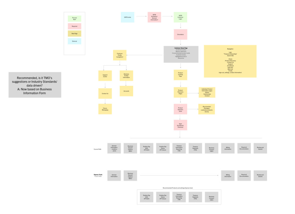
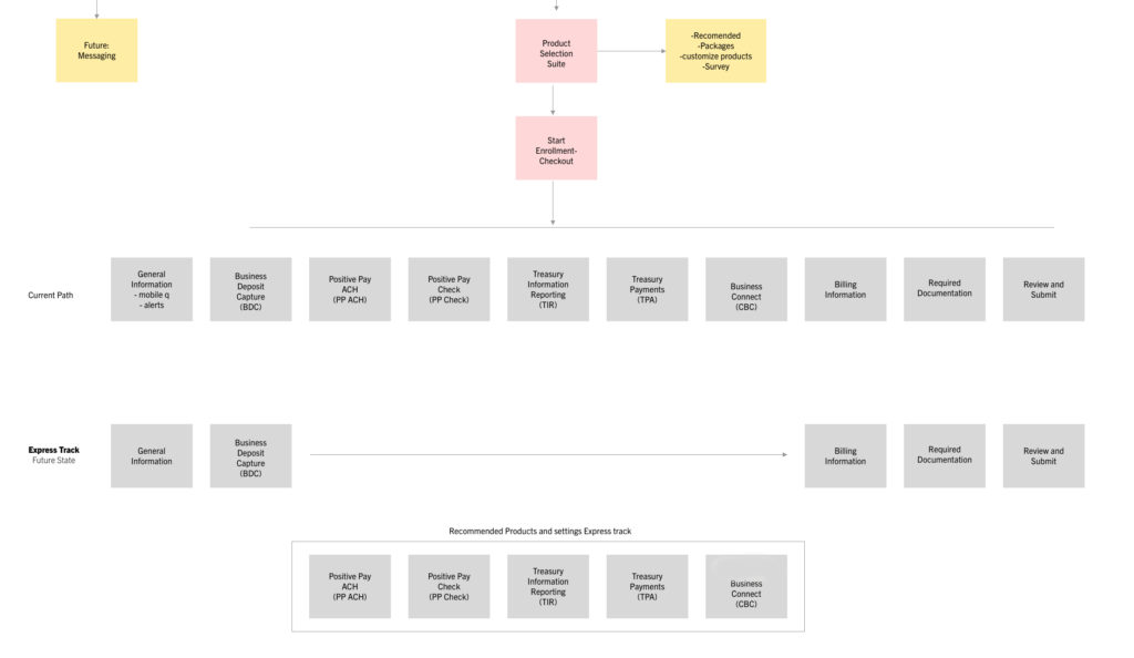
IA: Fast Track
Through testing the enrollment process we learned users were experiencing “form fatigue”, creating a less desirable experience with more errors. I wanted a way for users to avoid this by giving them the option of using “Recommended” settings on a series of forms, sending them on a fast track to complete their enrollment.
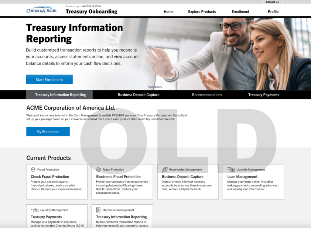
Less noise
The initial home page designs gave a confusing message to users with an active carousel showcasing products complete with a CTA on each slide, another CTA below, and the enrollment status below that.
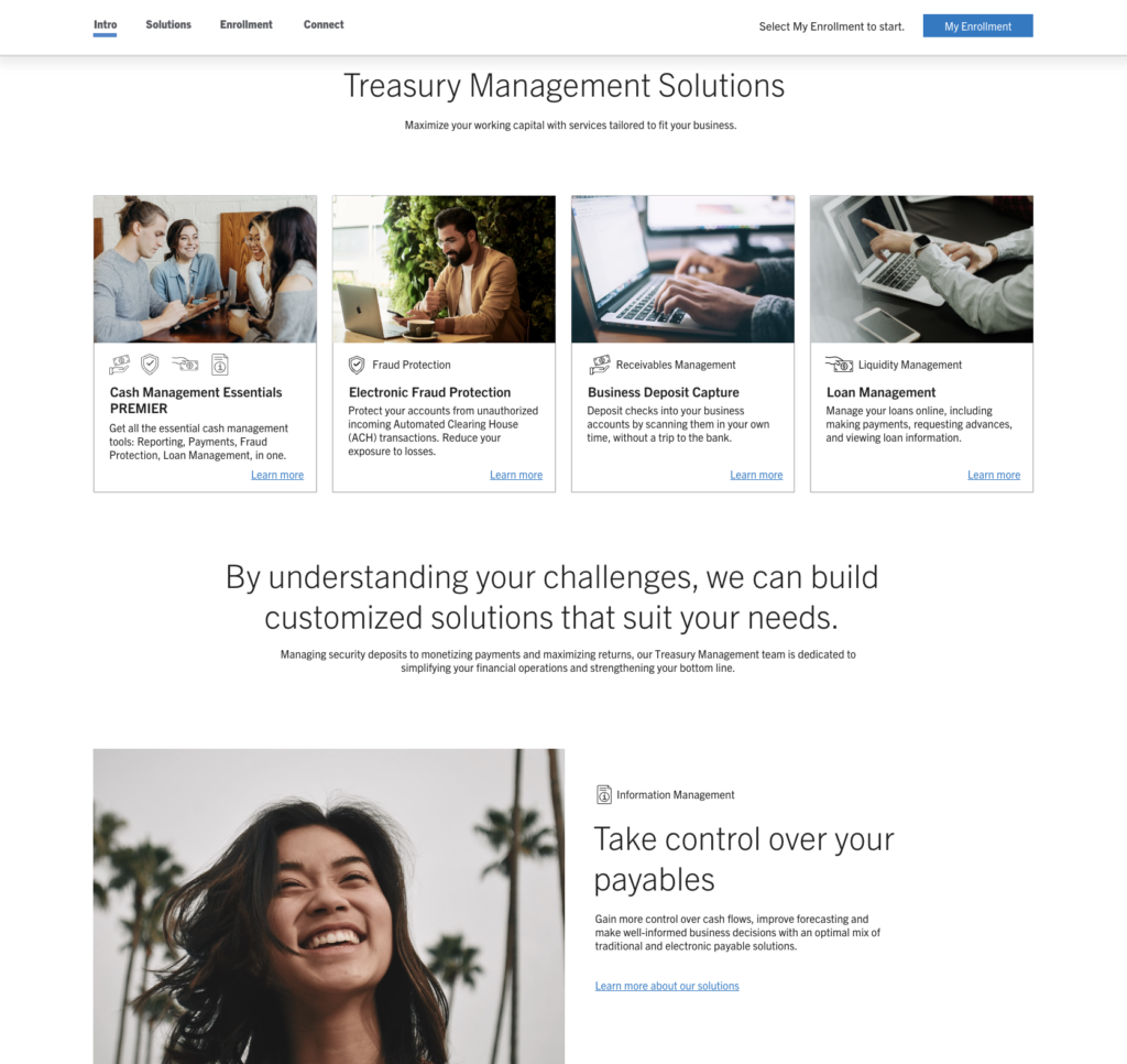
I searched the internet for a more elegant solution that would give the user the ability to move about the page while having only one CTA. Based on my research I mocked up a prototype with one CTA/ navigation bar that transitions to the top navigation at a scroll point. The enrollment status section was also designed to mimic the spreadsheets the TMO’s are familiar with.
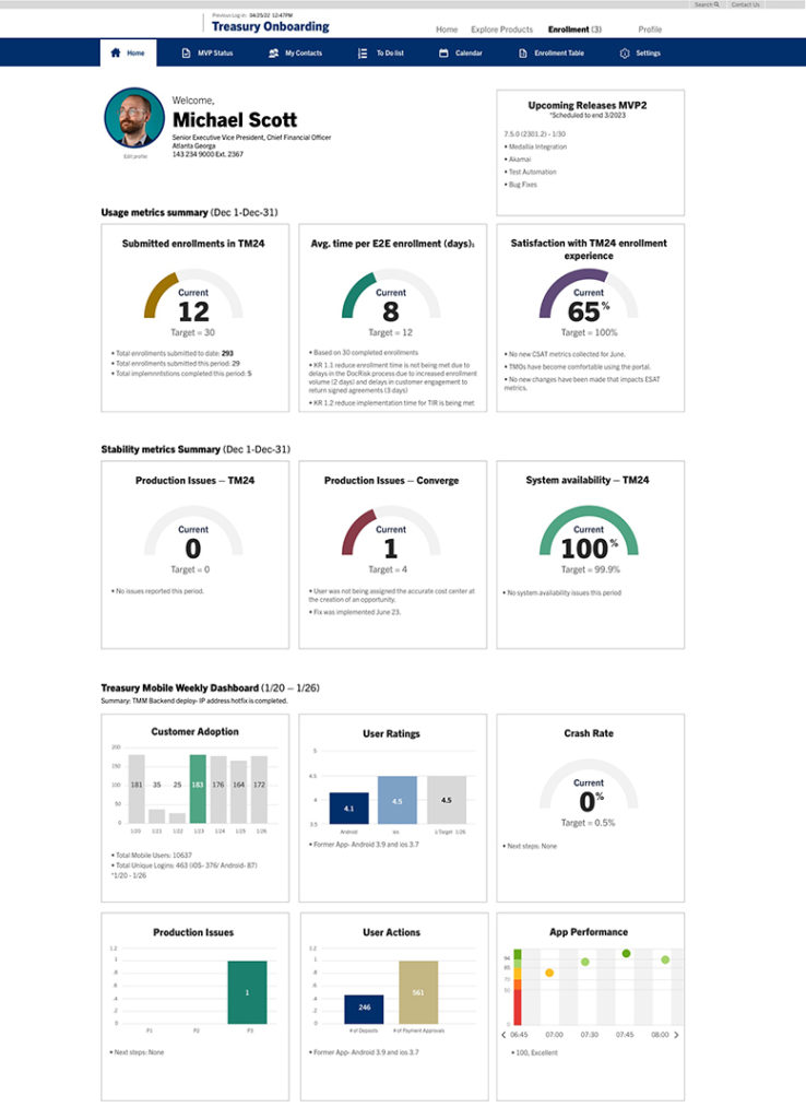
TMO Dashboards
Future design concept based on TMO’s current information tables provides a quick read on most important information by color coding topics and using proportional charts with the ability to dive deeper into the data when needed.
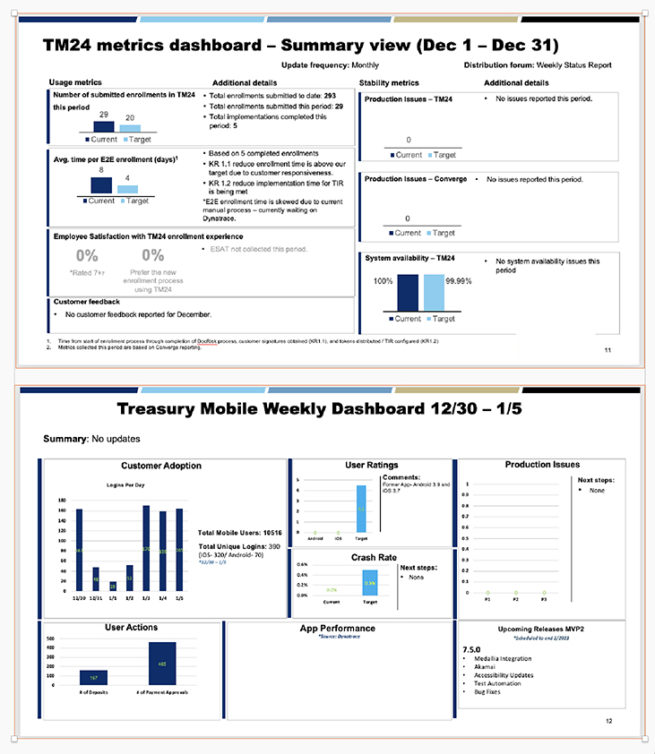
Current TMO dashboard
The more a design supports users in easily and efficiently doing what they want to do, the more they like the design
Leassons learned:
• Know your team and how you can contribute
• Learn Developers process and pain points, meet them where they are
• Pick your moments to Educate the client about the UX/UI process, explain why it’s valuable
• Typography and white space can help diminish noise
• Accessibility is experience design
A working UXPin prototype is available upon request.


