REDESIGN WEBSITE THAT PROMOTES FOUNDATIONS’S DEDICATION TO SAVING CORAL REEFS FOR FUTURE GENERATIONS.
My Role: Information architecture, User research, wireframing, low fidelity prototype, Logo development, visual design system.
Overview
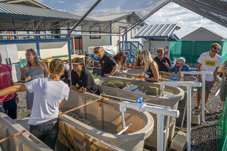
Through partnerships with seaside communities, Legacy Reef Foundation exists to create healthy reefs throughout the world; ensuring that coastal residents have a sustainable food source for generations to come.
The Task:
What started out as a logo redesign evolved into additional tasks of redesigning their website’s information architecture, layout, and visual design system.
My Role:
I was responsible for conducting user research while developing the information architecture, midlevel prototype, logo development and visual design system.
• Duration: Over two months, part time
• Tools: Miro, Zoom, Adobe XD, Photoshop, Illustrator
Problem
Interviewing five users reveled visibility problems as well as navigation overload with too many options on the almost invisible header. Users experienced friction navigating with inconsistent design system, not knowing what is an active link or button
Solution
Build clear information architecture based on UX/UI best practices and user feedback from both staff and users outside organization. Develop a consistent design system that leverages emotional full width imagery with bold typography. Make CTA clear with a controlled color pallet.
Miro and Zoom Sessions
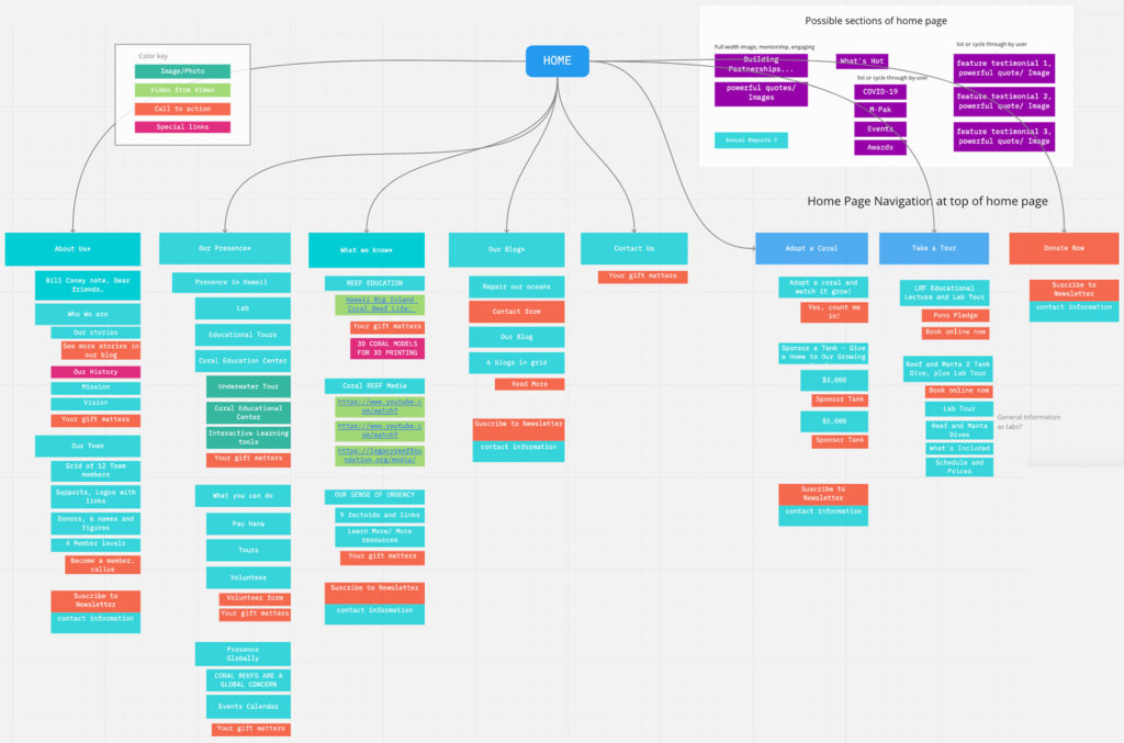
I led three Zoom sessions with my client while working with Miro to develop the information architecture. In between these sessions I incorporated client feedback for the next iteration.
Wireframing
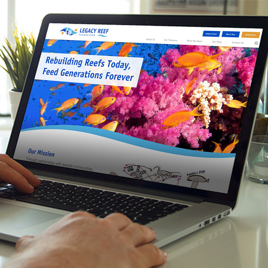
Combining key stakeholder notes, user feedback and the visual design system based on the new logo, led to a clean informative interface.
- Consistent typography system
- Use of design grid
- Designated CTA color
- Consistency in elements/functions
- Better balance of content and photography
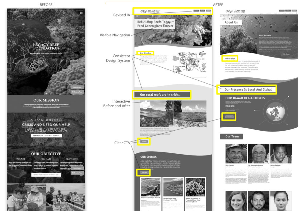
Visual Design System
It was important for the titles to positioned over the vivid photography using a flexible grid system so the type didn’t cover the best parts of the images, creating more emotional appeal.
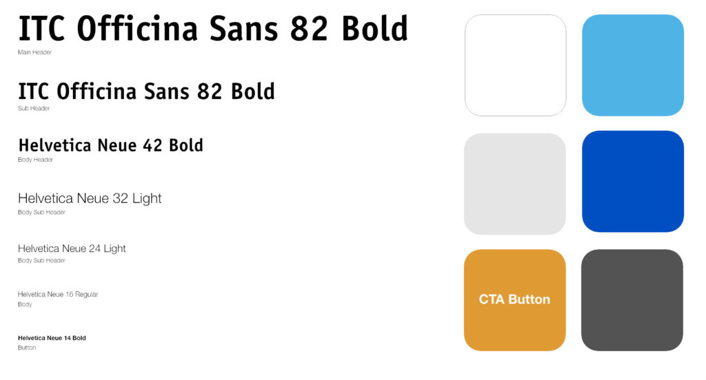
Style Guide
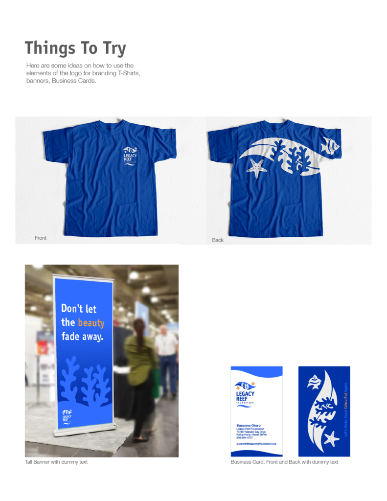
A visual guide was developed for non designers to help keep the branding strong while being flexible and open for future digital needs. Examples for business cards, trade show banners, and T-shirts are suggested as possibilities for the organization to explore.
Clickable Prototypes
Prototypes were developed and iterated based on feedback from five users and main stakeholders.
Low-Fidelity Prototype
High-Fidelity Prototype
Next Steps:
- Build full color high-fidelity prototype
- Conduct further user testing and iterations.
- Hand off the prototype and design system to the organization’s developer.
- Conceptualize interactive apps/games that promote creation of healthy reefs
Lessons Learned
- The balance between imagery and content is important to the site’s impression
- Map out clear goals and timelines to keep everyone motivated
- Anticipate growing the site alongside the organization’s growth
